4. ESXi Configuration
Use this dashboard to view the overall configuration of ESXi Hosts in your environment, especially the configuration that need attention.
The dashboard is designed with the same considerations that are common among all the configuration management dashboards.
How to Use
The dashboard is organized into sections for ease of use.
The upper part of the dashboard displays basic ESXi configurations that should be standardized for ease of operations.
- There are six pie-charts that are displayed as one set because there is a relationship in their values. There should be a correlation between them. Ideally, the ESXi version, the ESXi build, and the BIOS should be identical across all ESXi hosts in a cluster". Keep the variations of hardware model, NIC speed, and storage path minimal. The more complex the pie chart, the more variants you have. This results in complex operations, potentially resulting in increased OPEX.
- The configurations should reflect your current architecture standard. Each pie-chart counts the occurrence of a particular value. A large slice signifies that the value is the most common value, and if that is not your current standard, then you must address it.
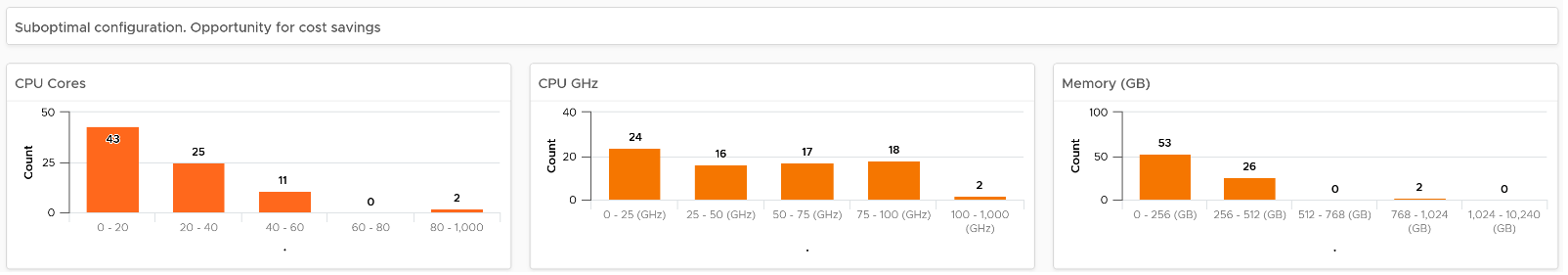
The second section of the dashboard displays configurations that are potentially suboptimal.
- The three bar-charts display various size dimensions of the ESXi hosts. The bar-charts are designed to be seen as one set. Ensure minimal number of variations to reduce complexity.
- Smaller ESXi hosts have a relatively higher overhead, and are limited in running larger VMs. If they have a low core count, they could be using outdated CPU. Small ESXi hosts are more expensive on a per core, per GB, per rack unit basis than larger ones if they occupy the same space. On the other hand, a 4-CPU socket ESXi host is likely to be too large, resulting in a concentration risk (too many VMs in a single ESXi host). Maintain a good balance that balance your budget and risk constraints . You should adjust the distribution chart bucket size to fit your environment.
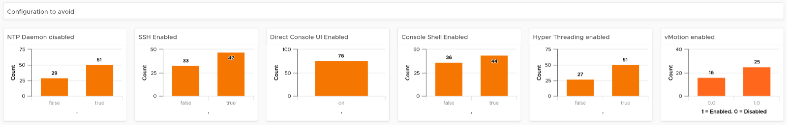
The third section of the dashboard displays configurations that you may want to avoid.
- The six bar-charts focus on security, availability, and capacity settings that you can set as a standard. For example, you should consider enabling the NTP daemon for consistent time, which is critical for logging and troubleshooting.
- The three tables list the actual ESXi hosts that are in a non-productive state. They can be in maintenance mode, powered off, or in a disconnected state.
- BTW, I’ve modified the last one to show information, to show an example if that makes sense for your operations. I do not do it for the out of the box version as visually it will look awkward as the first 5 charts do not need it.
The last part displays all the ESXi hosts in your environment.
- You can sort the columns and export the result into spreadsheet for further analysis.
- Some of the columns are color coded to facilitate quick reviews. Adjust their threshold to either reflect your current situation or your desired ideal state
Points to Note
- The number of buckets on the pie chart or bar chart are balanced between the available screen estate, ease of use and functionality. Modify the buckets to either reflect your current situation or your desired ideal state.
- In a large environment, create a filter for this dashboard. Group by the class of services such as, Gold, silver, and bronze. Default the selection to Gold. In this way, your monitoring is not cluttered with less critical workloads.
- For a more complete visibility, consider adding physical server monitoring by using the appropriate management pack. More info here.
This page was last updated on July 1, 2021 by Stellios Williams with commit message: "Cleaned MD syntax, added img alt-text, re-added links, changed heading levels"
VMware and the VMware taglines, logos and product names are trademarks or registered trademarks of VMware in the U.S. and other countries.