3. Live Cluster Utilization Dashboard
This dashboard complements Live! Cluster Performance dashboard. Use this dashboard to view the clusters and ESXi hosts within those clusters that are working excessively and are close to their physical limit. This dashboard displays ESXi hosts which have CPU or Memory saturation, and which can lead to performance issues for the VMs running on the host.
As this dashboard is designed to complement the Live! Cluster Performance dashboard, it shares the same design consideration.
2 counters for Memory are used as Consumed metric alone is not enough. It could be mostly cache or historical data. Balloon also persist (past data), but at least it gives an insight of ESXi under memory pressure.
How to Use
As this dashboard has identical design with the Live! Cluster Performance dashboard, it has the same usage procedure.
The dashboard help answer the following questions:
- Is the IaaS running very high utilization right now?
- Do we size ESXi correctly, meaning balanced usage of CPU and Memory?
- Are the clusters balanced? Are load distributed equally among member ESXi hosts?
- Is all ESXi contributing? Light grey box indicates that the host is part of the cluster but there is no utilization. It is likely the host is in maintenance mode or is powered off.
The following heat maps are designed to work as one set. Notice the arrangement of the boxes are identical across the 3 heat maps. If you guess that an object is placed in the same location in all the heat maps, you are right! This identical position means you can quickly see if a particular ESXi or cluster is having what problem.
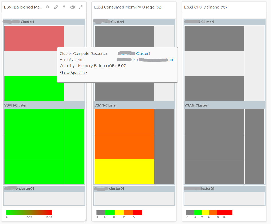
Unlike the heat maps in the Live! Cluster Performance dashboard, the 3 heat maps in this dashboard has a different scale, reflecting the different nature of the counters.
Logically, memory is a form of storage. It acts as a cache to disk as it’s much faster. Hence a high utilization is better, as that means more data is being cached. The ideal situation is when ESXi Consumed metric is red but ESXi Ballooned metric is green. When Ballooned is red and Consumed is grey, it means it was likely high in the past but not anymore. The reason the ballooned stays red because the ballooned pages were never requested back.
Ballooned memory counter was chosen over the swapped or compressed memory counters as it’s a better leading indicator. Because all 3 can co-exist at the same time, all 3 are shown in the line chart. Ballooned is shown in absolute amount and not percentage, as the higher the size the higher the chance it might impact a VM. If you feel using percentage is easier for your operations, create a super metric to translates the value.
Quiz Time: why is the heat map showing grey and light grey?
Points to Note
- ESXi choose swapping over compression if the compression ratio is less than 4x.
- If you have the screen real estate and your network is highly utilized, add a Heat Map to check the ESXi physical NIC Network Throughput.
This page was last updated on July 1, 2021 by Stellios Williams with commit message: "Cleaned MD syntax, added img alt-text, re-added links, changed heading levels"
VMware and the VMware taglines, logos and product names are trademarks or registered trademarks of VMware in the U.S. and other countries.